User Research: Tell Me How You Really Feel.
We received a large packet of information from the client, detailing the specs of the application and their market, but there was no user research done explicitly for the SeeDC app. Our plan was to make sure that the users told us what they wanted their app to look like. From there, we would be able to filter out the most important features to display on the landing page.
The team used contextual analysis, online user surveys, user interviews, personas, task analysis and affinity mapping to gather information during the research process. Using the information from the client, we targeted the groups that visit DC the most: families and weekend travelers. From the research we were able to prioritize features for both the website and the app.
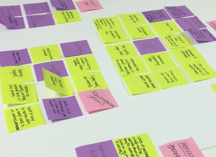
Affinity Mapping
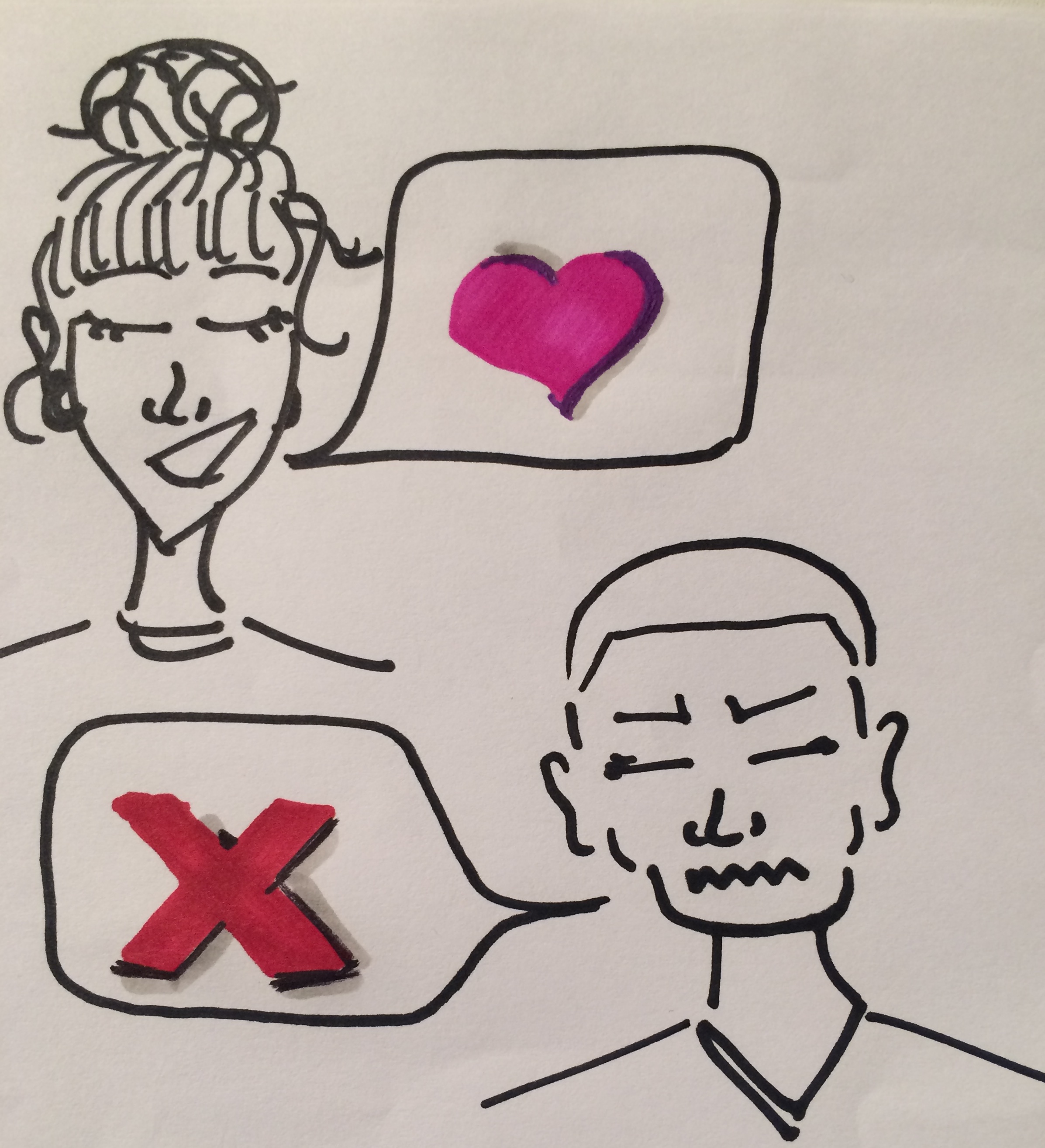
Along with one member of the client's team, we headed to the National Mall where we interviewed several groups of people. The group was both international and local, and came mostly with children. From my conversations, I realized that some of the user's pain points and concerns were not easily accessed through the current application. I made sure to relay that information to the FCC to come to a concensus about what we should showcase on the landing page to encourage users to download and share the SeeDC app. I did this by creating three personas with different goals, but similar pain points.
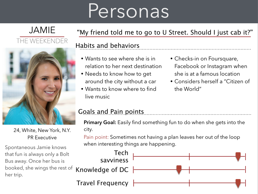
One of Three Personas
Competitive Analysis: The Lay of the Land.
For the competitive analysis we looked at both companies that the FCC identified as competitors during our initial briefing. This included travel companies with interactive websites and applications. We also looked at landing pages in general to see any correlations in the layouts. We continued to reference the competitive analysis during our design process.
We found that layouts for landing pages were fairly simple and featured large photos and large text. The tone of the pages was conversational, which helped with user engagement.
Select Competitors
Sketches and Wireframes: Design. Chat. Do It Again.
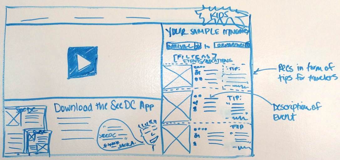
We held several design studios that helped us generate a one page layout for our landing page. The photos below include early sketches and a screen shot of the final wireframe.
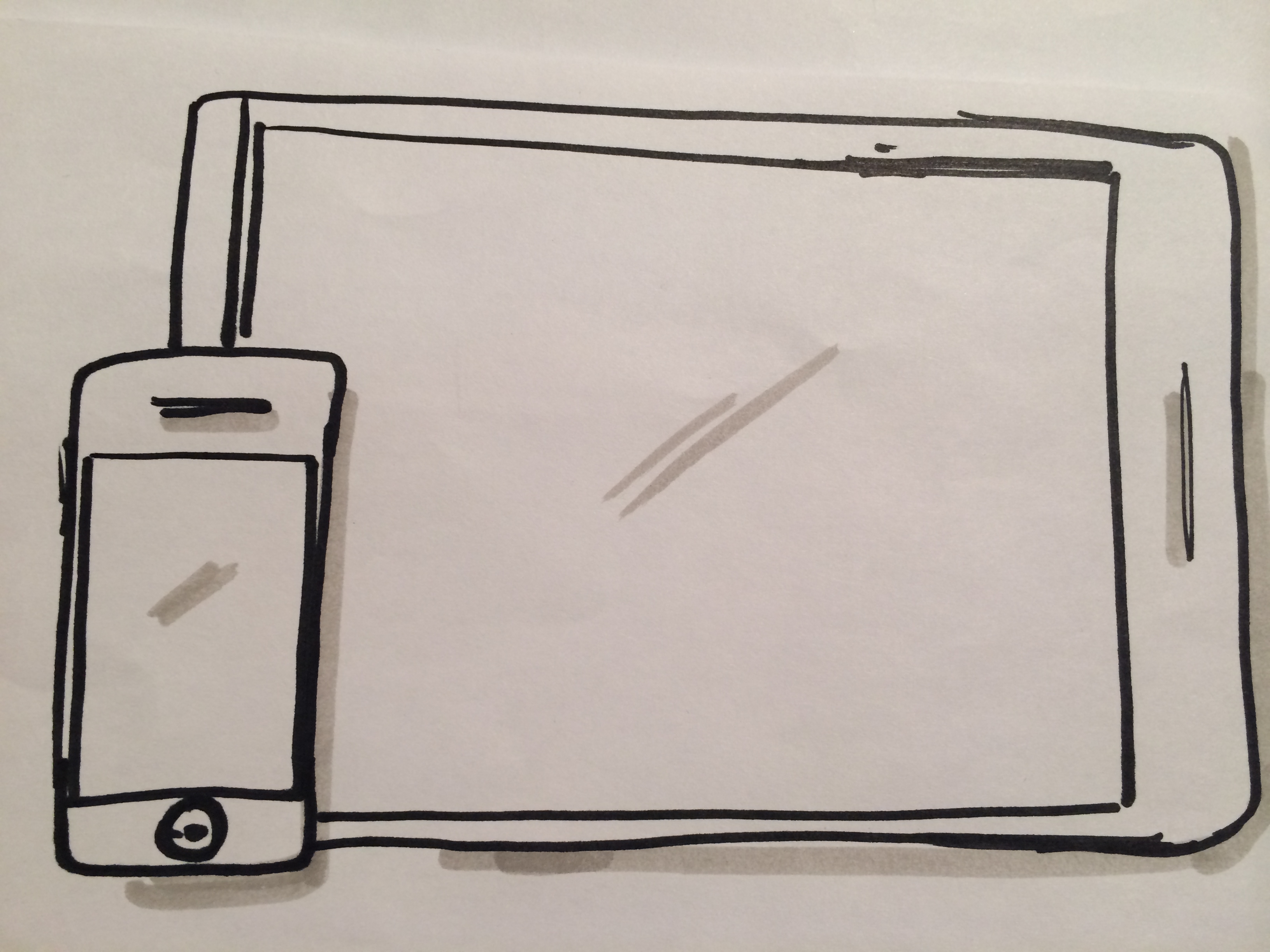
Initial Sketch
Iteration after iteration, we slowly removed features from our busy landing page. Initially, we wanted to have the landing page showcase the app's features by making it interactive (i.e. giving users the ability to enter their travel information and receive potential event and tourist attraction matches). After performing user testing on those layouts, we figured out how to make the page exciting to look at, but much less crowded.
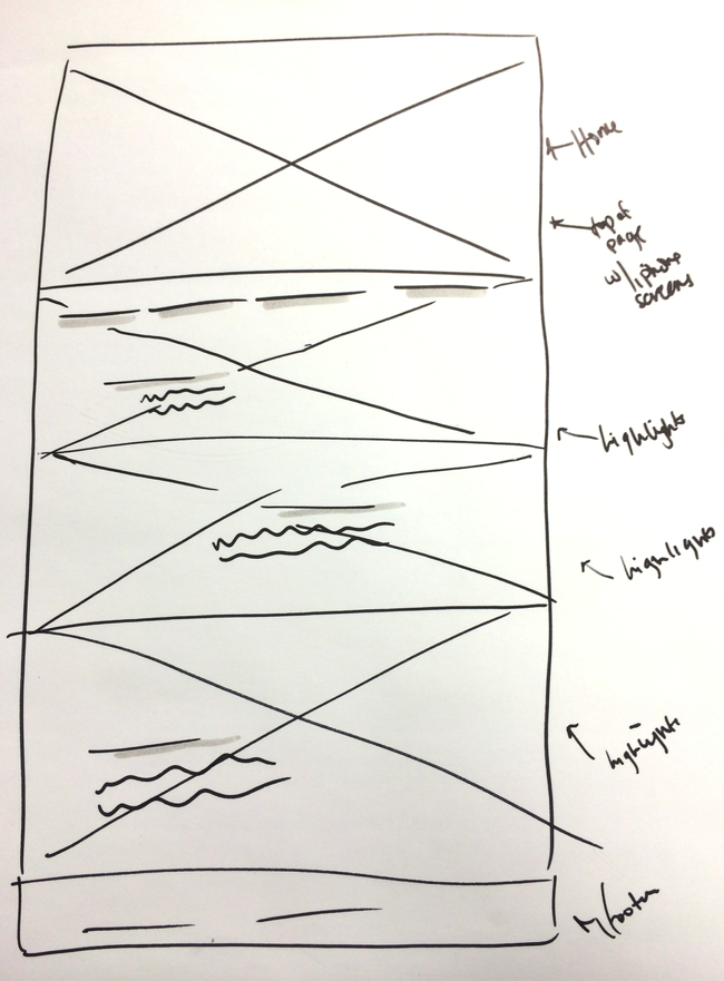
Most Recent Sketch
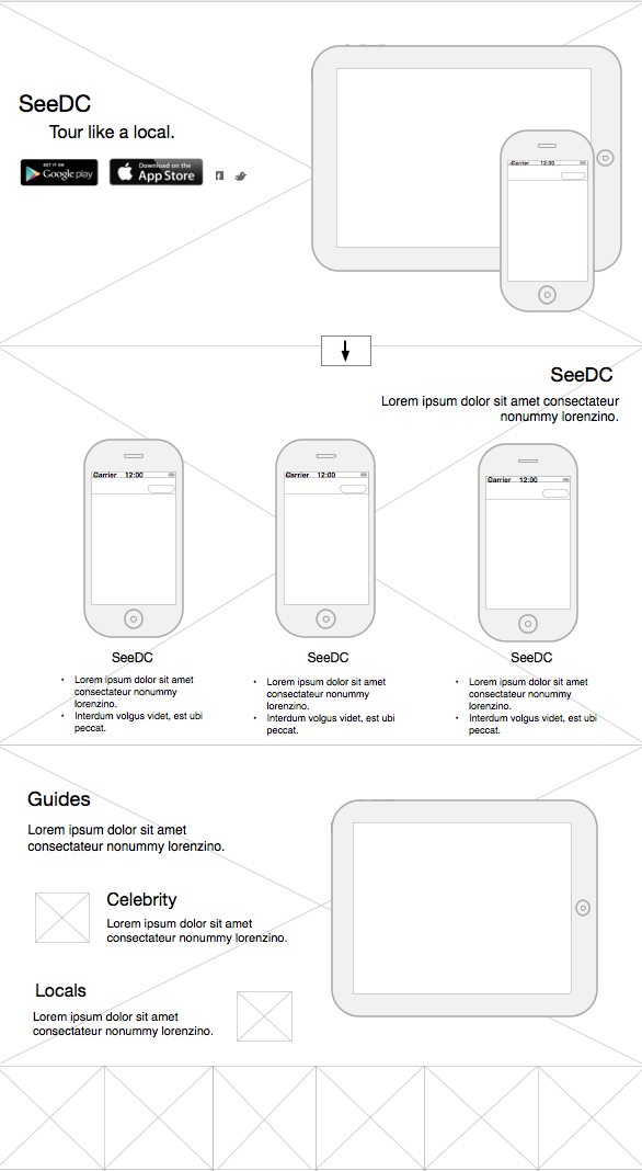
Screenshot of Wireframe
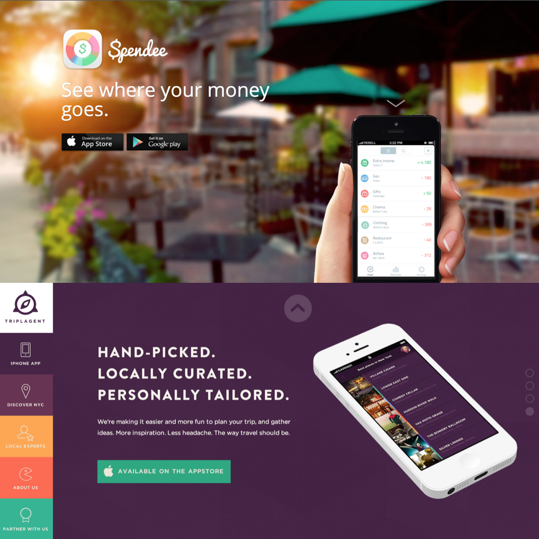
Visual Mockups: Polish It Off.
We generated several mockups for the landing page using both Keynote and Wix.com. We used Keynote to gauge the clients' interest in our use of large photographs, color and minimal text.
After consulting with their developer, who was not initially included in the website design process, the FCC returned to us with a list of edits that primarily were concerned with layout. The Keynote presentation we sent did not accurately explain the concept that the slides were not meant to be individual pages, but simply components to a single-page layout. I learned that stakeholders can enter the design process at any time and it is my job as a designer to take that into account. To ensure that the final mockup easily displayed the single-page layout, I created it with Wix.com. This was delivered to the client at the end of the engagement.
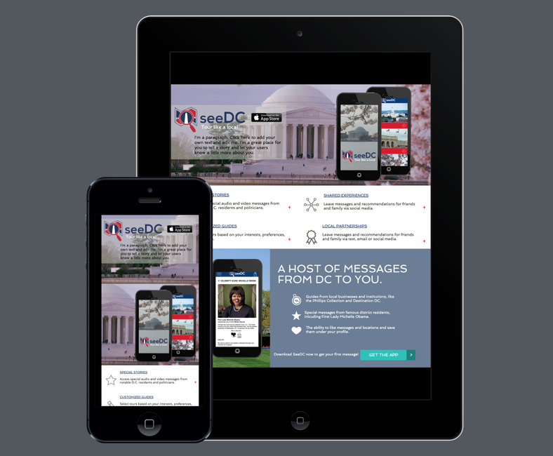
Mockup Mobile Screenshot
The final mockup highlighted the application's video capabilities, personalization features, and the ability for businesses to partner with SeeDC. We kept the design simple to ensure that the features were not overpowered by the design.
Results and Takeaways: Our Next Steps.
The client will be taking our wireframes and mockups to their internal team. They hope to get the site up this month (August 2014). Additionally, we will continue our discussions about additional app features that may be added to a future launch. I will be building a landing page in HTML, CSS, and JavaScript to further hone my coding skills. This markup may be included in our conversations.